Cockburn's Port
Art directed bottle shots
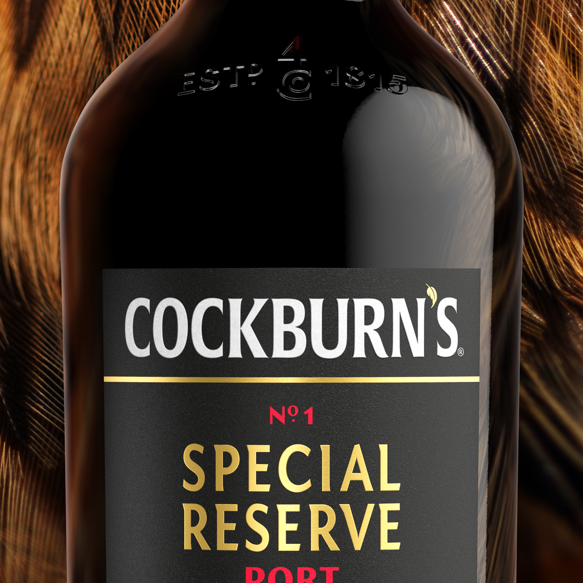
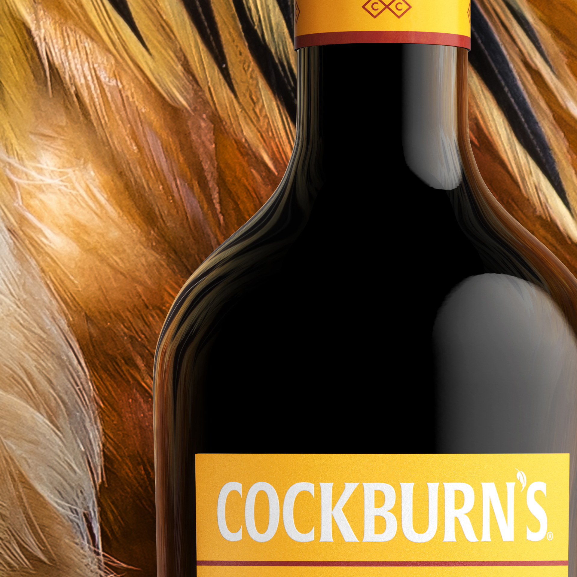
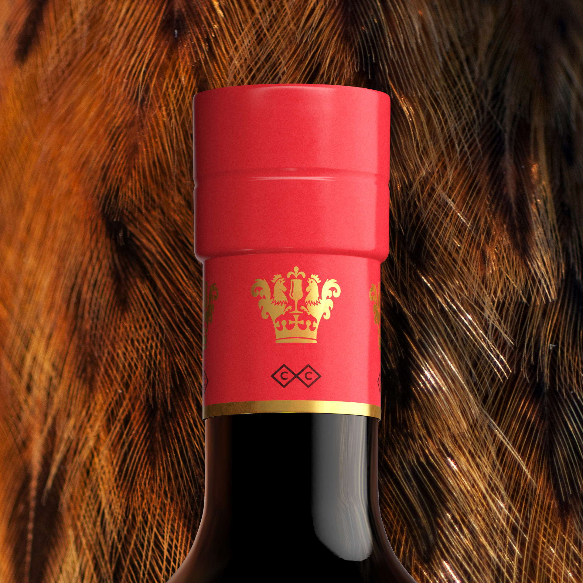
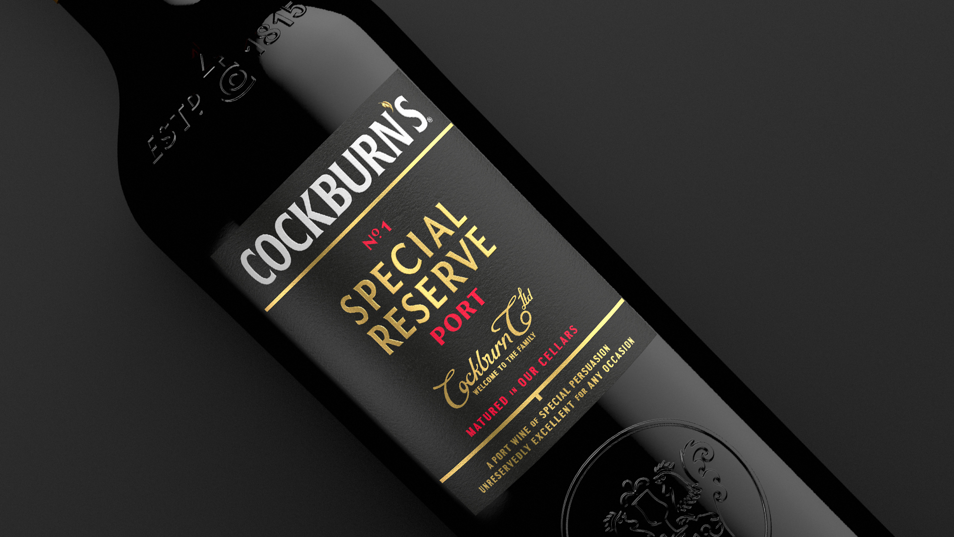
In brief
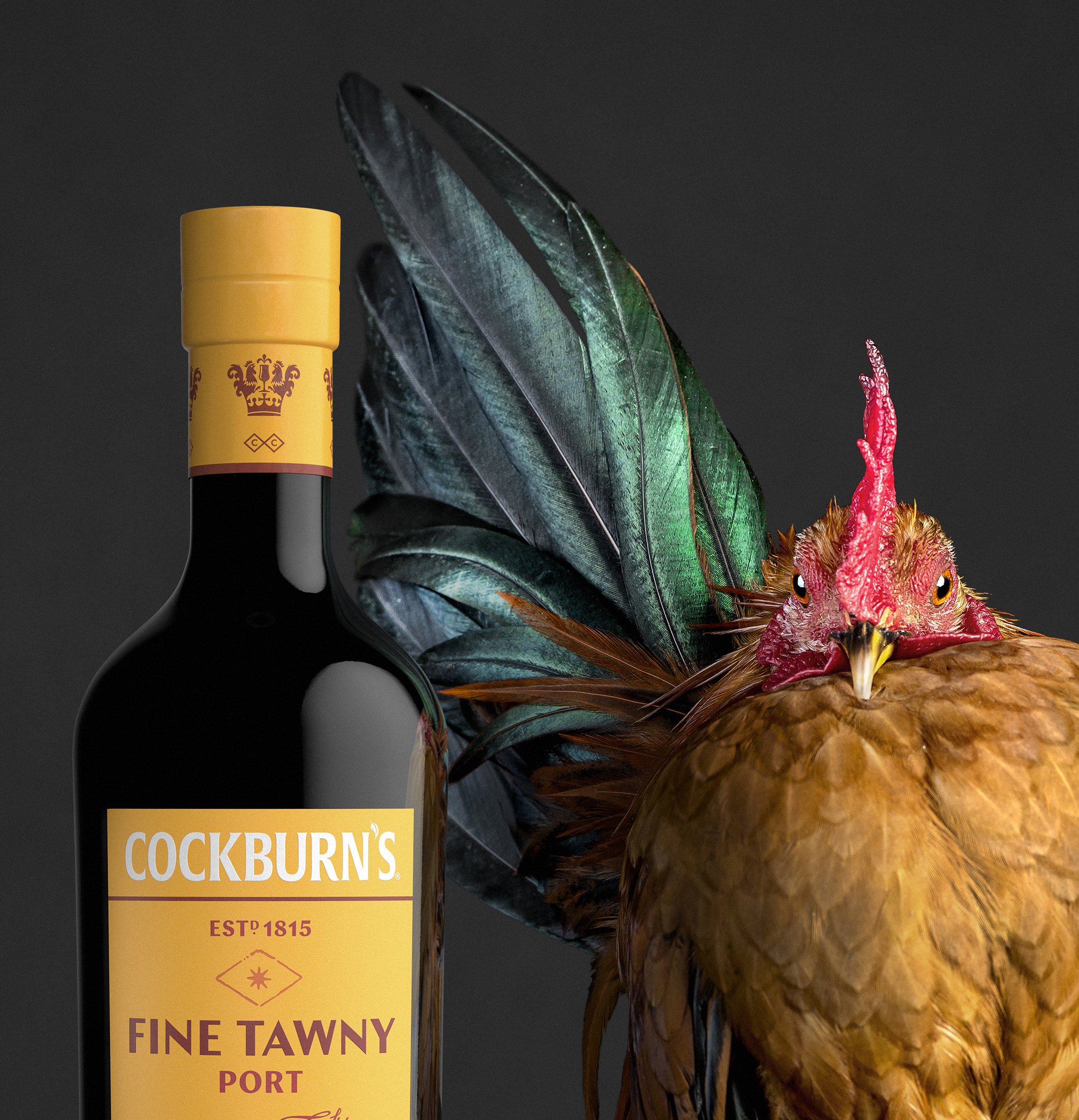
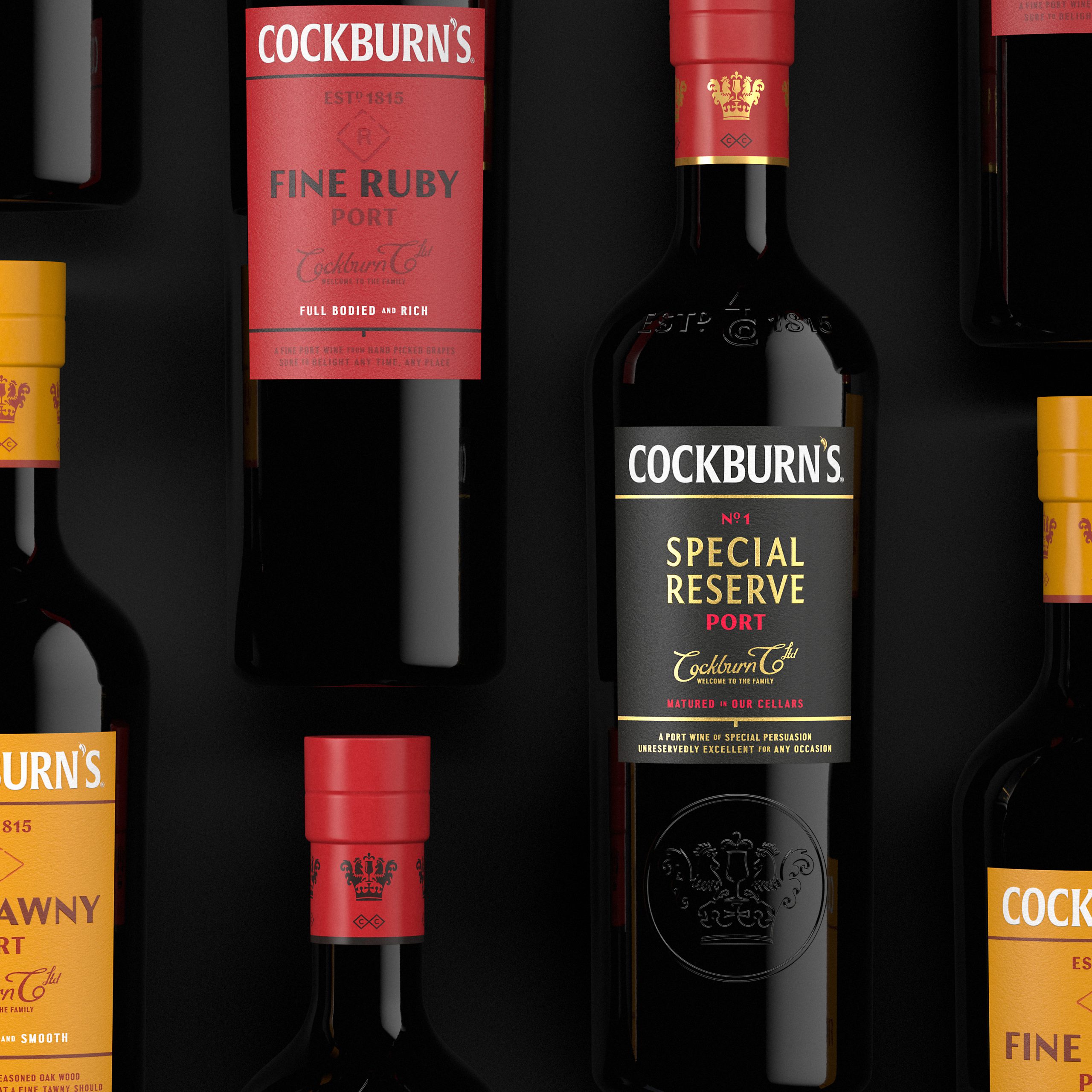
Campaign visual that showcase subtle textural detail of the packaging design.
In detail
Eskimo Square visualised the new Cockburn’s brand in a series of art directed bottle pack shots. It was important to the client that the visuals illustrated both the campaign message and the fine design details seen in the print process, label stock and glassware. The real world photography of the cockerels composited into CG bottle renders are a tongue in cheek nod to the often mispronounced name. The resulting series of vibrant campaign images celebrate the distinct character of each port and spotlight new design features.